
Visual hierarchy is a vital aspect of designing any content, whether it’s a webpage, advertisement, or any other content. It involves arranging the different elements in a way that enables users to process information quickly and efficiently. A well-structured visual hierarchy can make it easier for users to navigate through content, find what they are looking for, and understand the content presented.
On the other hand, a poorly designed hierarchy can be confusing and frustrating, leading to a negative user experience. Therefore, it is crucial to prioritize the elements on a page and organize them in a manner that makes sense to the user.
Reading typically follows a pattern where people instinctively read from top to bottom and left to right. Eye tracking has revealed two primary patterns in how we process visual information. Understanding these patterns can help us optimize how we create and present content to better engage our audience.
F Patterns
If you are working on a design project that involves a lot of text, you may want to consider the ‘F’ shaped layout. This layout is designed to help viewers easily navigate through the content. With this layout, the viewer’s eyes naturally follow the shape of the letter ‘F’, starting from the top left corner and moving horizontally across to the top right. They then scan down the left-hand side of the page in search of short headlines or subheads that they can quickly scan through. This format effectively makes the text more readable and user-friendly and can be a great tool to help you create a visually engaging design.
Z Patterns
If you want to create a design easier for viewers to follow, consider using the ‘Z’ shape method. This approach suggests placing the most important elements of your design at the top left and guiding the viewer’s eyes across to the top right corner. Then, you can lead their gaze downward on a diagonal slope towards the lower-left corner and finally across to the right-hand corner. Following this pattern can help ensure viewers take in all the important information in your design.
Layout
When designing a layout, it’s important to consider the placement of key elements. These patterns help provide specific guidance on where to position these elements. By following these patterns, you can ensure that your design is aesthetically pleasing, functional, and effective in communicating your message to your audience.
Visual hierarchy plays a crucial role in making your design more effective by directing viewers toward the focal point and presenting the crucial information clearly and organized. Utilizing visual hierarchy effectively can improve the user experience and make your design more engaging and impactful.
Font Size
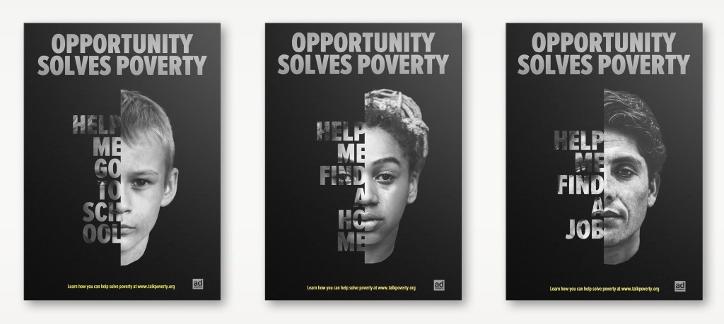
One of the most constructive ways to make an object stand out is to enhance its visual prominence. Increasing both the size and scale of the object in relation to others can effectively draw the attention of the viewer.
On the other hand, design elements that are less important can be reduced in size to make them less visible and lower in the visual hierarchy. Achieving balance and moderation is crucial in design. A focal point that’s too large can overshadow the entire design, while secondary information that’s too small may hinder usability.
Color
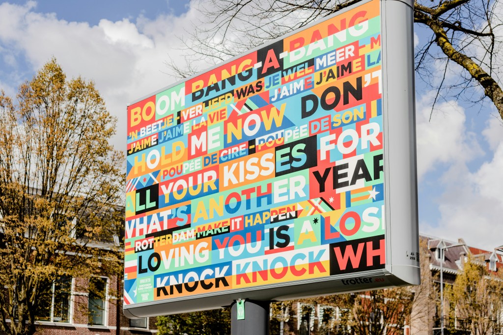
Colors have a powerful impact on us and can be used to communicate essential information or highlight significant details effectively. Bold colors like red or yellow are particularly attention-grabbing and hard to miss, whether on a traffic sign or a promotional flyer. By using colors strategically, we can ensure that our message is conveyed effectively and that the important information is not overlooked.
Typesetting
When typesetting, it’s not just the hierarchy that matters. The font style and category can also impact the overall design. It helps to think of them as having unique personalities. Some are bold and attention-grabbing, while others are more subtle but intriguing. And just like people, some typefaces are versatile and can adapt to different situations. By understanding the personality of each typeface, you can make more informed decisions and create designs that truly stand out.
Negative (White) Space
Creating a well-designed layout requires careful planning and attention to detail. To ensure that your design is easy to read and visually appealing, leaving enough blank space is essential. While it may be tempting to include as much information as possible, remember that white space is crucial for separating and organizing the different elements in your design and creating a balanced and harmonious appearance. So, leave enough white space in your layout, and your design will look professional and polished.
The Rule of Thirds
If you want to create an engaging and visually appealing composition, one technique to consider is the rule of thirds. By dividing your layout into a grid with three equally spaced horizontal and vertical lines, this rule allows you to place your focal point in a more interesting and dynamic way rather than just centering it. For optimal results, try positioning your focal point on one of the lines or at the intersection of two lines. This can help make your composition stand out and draw the viewer’s eye.
The Rule of Odds
If you’re looking to create visually appealing displays or arrangements, you might want to consider the “rule of odds.” This rule often involves using groups of three objects, as an odd number of items tends to be more interesting and pleasing to the eye than an even number. You can create a more dynamic and engaging visual display by arranging a focal point surrounded by two other items, or even four items, in an odd number. Try it and see how the rule of odds can help you create more visually appealing designs!
It’s crucial to carefully select and emphasize certain design elements to establish a clear visual hierarchy while allowing others to recede into the background. Over-emphasizing too many elements can lead to a lack of distinction, making it difficult for users to focus on the most important information.
Visual hierarchy can greatly improve the appearance and effectiveness of your design. You can create a well-organized and impactful composition that highlights the most important content by utilizing design elements such as color, contrast, typography, spacing, and other basic principles. By focusing on basic design principles, you can create a design that is aesthetically pleasing and effectively communicates your message to your audience.

