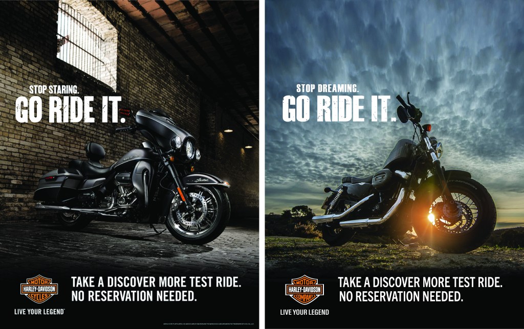
Campaigns are at the heart of advertising for any brand or company. It’s important to understand how to design an ad that will attract your target audience. In this analysis, I will explain the important aspects of creating an ad using design principles, color, and typography. I will also show and explain how to design an ad to complement the original existing ad for the same campaign.
ORIGINAL AD
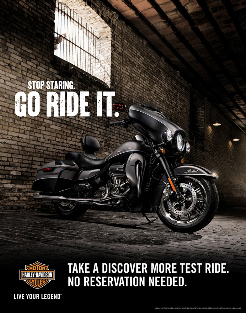
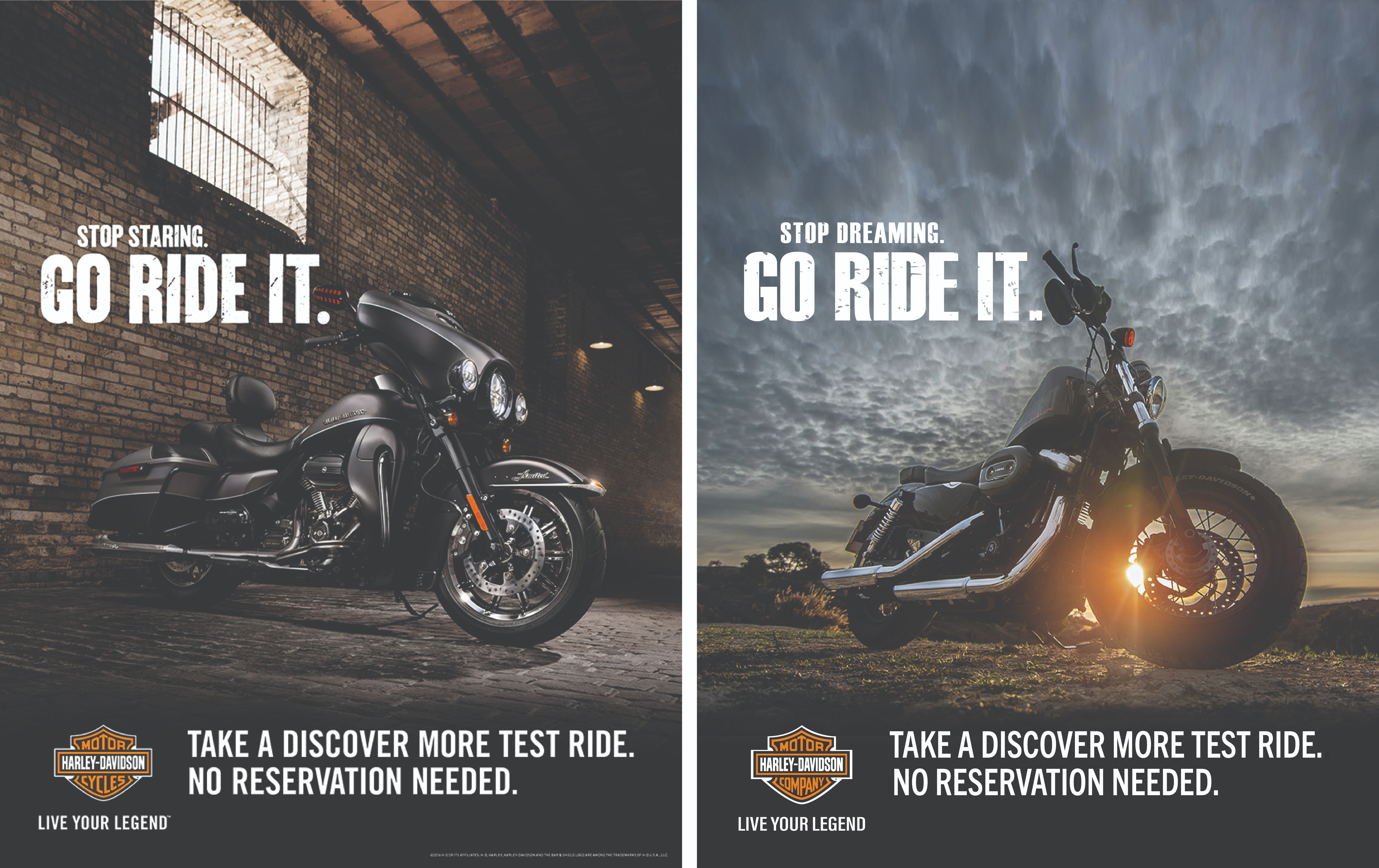
The above professionally designed advertisement was designed by John Teter who has created work for iconic brands such as Coca-Cola, Harley-Davidson, Royal Caribbean, Under Armour, and The Boy Scouts of America, to name a few. His creative ideas have been recognized by the Addys and Effies Awards. My analysis will show in what ways this designer used principles of design, color, and typography in his advertisement which together help make this advertisement successful.
Contrast
Contrast adds visual interest to a page and creates a visual hierarchy between elements. It’s important in any design to get your viewer’s attention and take them on your design journey. You don’t want them skipping their eyes around the page not sure what to read or when to read it. Contrast helps create a visual hierarchy to navigate your viewers appropriately.

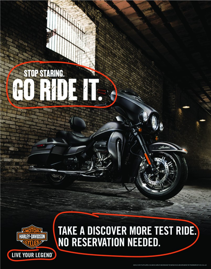
Notice above, the contrast between the white type and dark image or black background on the bottom. There is a strong visual contrast you clearly notice between black and white. The designer also used the contrast between font weights, especially in the headline. The words GO RIDE IT are much bolder than any other type. The distressed letters also add contrast in comparison to the call to action at the bottom of the ad.
Repetition
Repetition unifies and adds visual interest to a design. It can be understood as consistency. The designer uses repetition in an effort to organize, strengthen, and unify all parts of the design. This attracts the viewer and helps them understand a unified message.
You can see above all of the text is set in bold white, and although the headline and call to action at the bottom are two different typefaces, all text is using Sans Serif fonts. This repetition provides a sense of unity with its message as well as visual interest in this advertisement.
Alignment
Text or items that are aligned on a page will form a stronger more cohesive design that will be clean and easy to read. Nothing should be placed arbitrarily. Visual connection is important for the viewer to understand your design and overall message. The alignment in your design will help create a more visual connection that will keep your viewer engaged longer with your design.
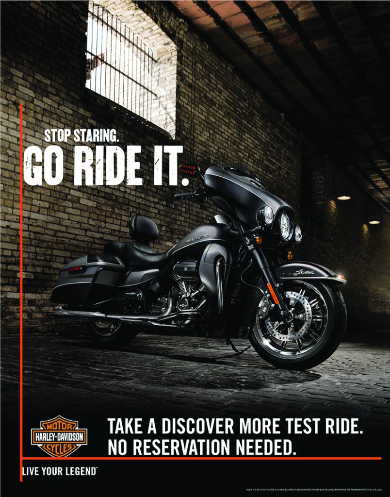
You’ll notice the headline GO RIDE IT is aligned with LIVE YOUR LEGEND. These two very powerful statements captivate the audience. The logo and call to action at the bottom are aligned together to create balance and give this ad a clean and sophisticated look. This alignment keeps the information organized and easier for the reader to follow and understand. It’s important to remember, sometimes, less is more. More successful ads keep it simple, but impactful.
Proximity
The purpose of proximity is to group related items together which helps them form a cohesive group rather than bits and pieces scattered in an unorganized way. When you group similar elements or texts into one unit the page becomes more organized, more easily understood, and helps the viewer know where and when to read and finish.
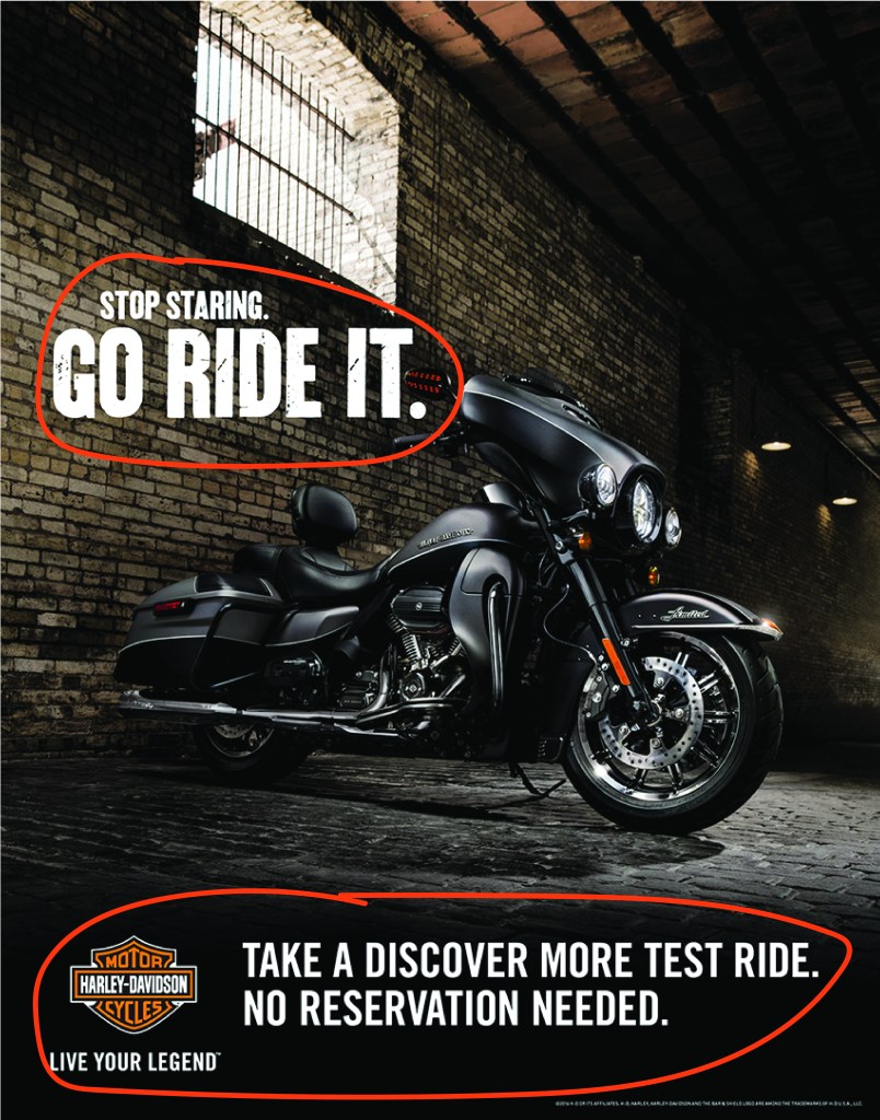
You’ll notice above how the Headline is one message, and the call to action with information is grouped together at the bottom. All group-related texts are separated by the image and negative space. Each group in its proximity is strategically placed to help organize the text making it much easier for the viewer to find and understand the information given.
Color
Color is an important part of any design, especially when working with brands. Color helps get the attention of viewers, unifies the design, and can help deliver a stronger message representing the brand. Generally, it will enhance the aesthetics of your design. A strategic use of color will create a visual hierarchy that can give emphasis to something you want to give emphasis on in order to convey a stronger message.
The designer used the branding colors of the company for the viewers to identify with this brand. Harley-Davidson’s brand uses orange, black, and white in its logo and all of its branding. It was highly appropriate to use those colors as a basis for this campaign ad. These are also contrasting colors that compliment each other very well making it easy for the viewer to look at and understand. The image used white in the window, but dark in the rest of the image making it easier to add white in contrast for the type. The black motorcycle, dark shadows complemented the black strip on the bottom where the type could have a stronger bold contrast for the viewer. All colors complement each other very nicely.
Typography
When designing for ad campaigns, Typography is extremely important as it should always use its message to captivate its viewers. There are four main elements that should be used in a campaign ad. These elements are the headline, copy, call to action, and logo. The headline should be the first thing people read. It should be bold and large, and capture the attention of your audience. The idea is to draw your audience in so they keep looking and keep reading further.
Remember when I said earlier, sometimes less is more? This ad proves that statement true. Notice how the headline above stands out first. It’s the largest thing you see, but it’s a short, simple statement that grabs the attention of the audience. The distressed look of the headline gives the headline character and matches the design and feel of the company. The typography should always represent the company and its message. The bottom copy and call to action are clean Sans Serifs which are easy to read, but the designer also used short, simple statements. You don’t want to overwhelm your audience with too much copy. You should always get to the point. The typography in this ad was done very well.
MY NEWLY DESIGNED AD

I designed the above ad to complement the original ad, but still have flexibility in the company’s product. The original advertisement was created to advertise Harley-Davidson’s announcement of the all-new Milwaukee-Eight engine – the most innovative, and most powerful in Harley’s 115-year history. However, the new ad is flexible for any of their motorcycles because it doesn’t name a specific type, but still has the overall feel and message of the company. I changed the image from an indoor image to an outdoor image to give another perspective of the product to help the viewer imagine the product differently. I will show how this new ad uses the same important design principles to work together to make this advertisement successful.
CONTRAST

Contrast adds visual interest to a page and creates a visual hierarchy between elements. Notice above, how similar the contrast is from the original ad with the contrast between the white type and dark image and the black background on the bottom. There is a strong visual contrast you clearly notice between black and white. I kept the contrast between font weights, especially in the headline as explained earlier in the original ad. I used the distressed letters which also add contrast in comparison to the call to action at the bottom of the ad.
Repetition

Repetition as explained earlier unifies and adds visual interest to a design. You can see above how all of the text is set in bold white, and although the headline and call to action at the bottom are two different typefaces, all text is using Sans Serif fonts. This adds repetition which provides a sense of unity with its message as well as visual interest in this advertisement.
Alignment

You can see above how the text and logo that are aligned on this ad form a stronger more cohesive design that keeps the ad clean and easy to read. This also adds a visual connection for the viewer which is important for the viewer to understand the design and overall message. Keeping the ad clean and simple helps the message stand out stronger.
Proximity

Since the purpose of proximity is to group related items together to form a cohesive group keeping things organized, I used proximity with the type the same way as the original design. When I grouped similar texts and the logo appropriately, the page becomes more organized, more easily understood, and became helpful for the viewer to know where and when to read and finish.
Color

To keep with the brand of the company and its message, I used the company’s branding colors so the viewers would identify this ad with the brand much easier. Color helps get the attention of viewers, unifies the design, and can help deliver a stronger message representing the brand. The image used white in the light behind the clouds and bike, but dark in the bike, hills, and black strip across the bottom make it easier to add contrast in white type. Although the image is different, the colors still complement each other as well as keeping along with the brand and campaign.
Typography
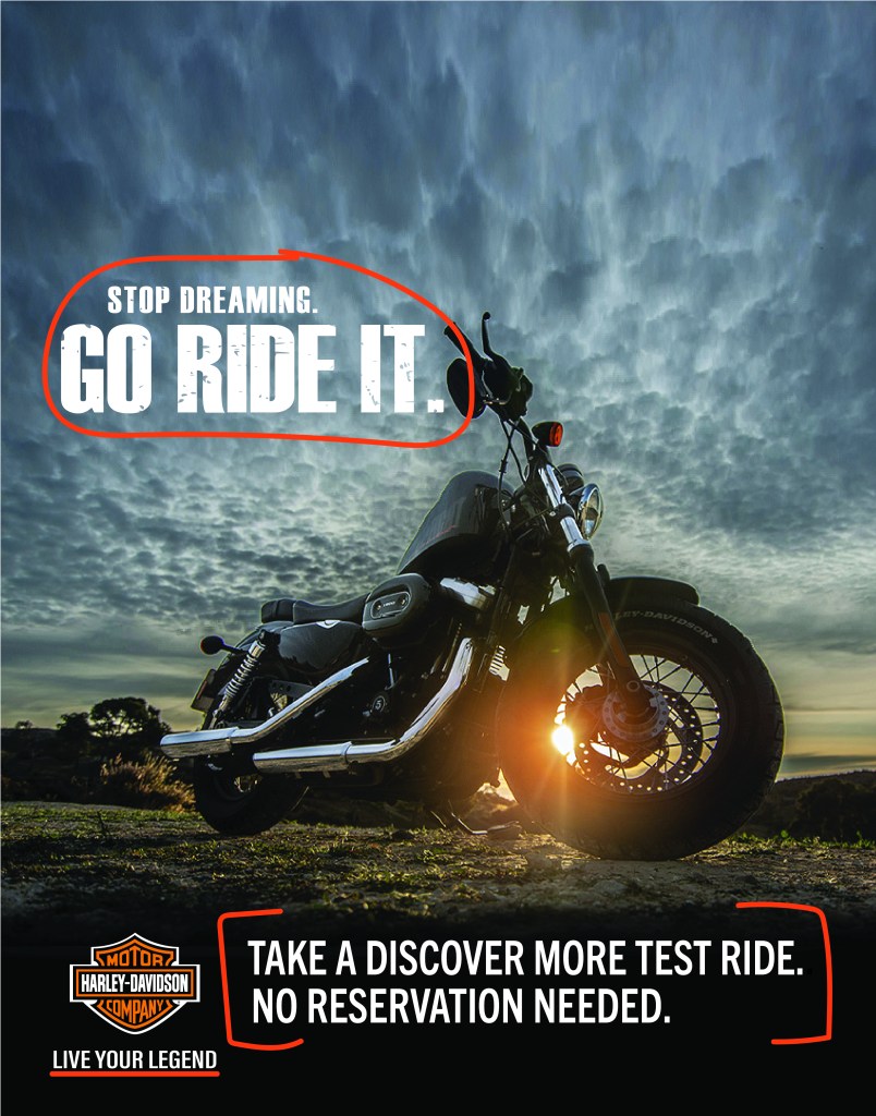
The above headline matches the original ad but with a slightly different perspective. Instead of Stop Staring, it says Stop Dreaming. People tend to relate dreaming with clouds. This helps convey the message from the image but keeps with the original headline that included Go Ride It. The typography is not only important in conveying the message to captivate its viewers, but it also adds visual hierarchy. I kept with the four main elements of headline, copy, call to action, and logo that should be used in a campaign ad. The headline is the first thing viewers will notice. It’s bold and large and will capture the attention of viewers. The distressed look of the headline matches the original campaign ad which as said earlier, gives the headline character and matches the design and feel of the company. The bottom copy and call to action are clean Sans Serifs as in the original ad which is easy to read, but short, simple statements viewers understand.
Conclusion
In comparison, both designs look like they are from the same campaign for the same company. When designing campaign ads, it’s important to keep to the same theme, message, and feel of the campaign but could be done slightly differently to reach a larger audience. Overall, both designs successfully used great design qualities by ensuring basic principles of design, color, and typography were used effectively.
- Contrast was used through color and font weight to add visual interest to the page and created a visual hierarchy between elements.
- Repetition with the use of colors provided a sense of unity with its message as well as visual interest in this advertisement.
- Alignment was used to make the information more organized, giving the text a common connected boundary, and making it much easier for the reader to follow where the designer wanted to lead them.
- Proximity in this design grouped related texts into one unit which organized the design and message to make it more easily understood and helped the viewer know where and when to read and finish.
- Color was used strategically in this design to capture the viewer’s attention with the bright contrasting colors as well as unify the design delivering a clearer and stronger message.
- Typography was used to make the page more attractive, organize the ad better, and used visual hierarchy to help the viewer know what to read first in order to capture their attention, and keep their attention.
Campaign ads are fun to design because they can make a powerful impact when using design principles appropriately and effectively. These two ads complement each other well. By using design principles, these ads attract the viewer and convey a strong message while keeping with the company’s branding style and overall message.

