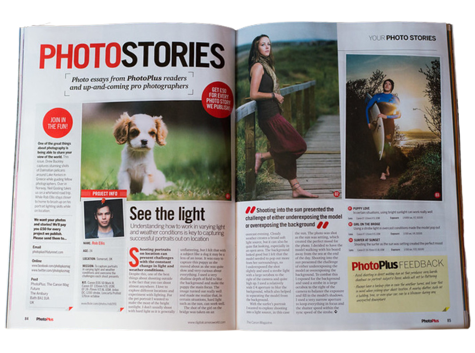
The above professionally designed spread was published by Photo Plus The Cannon Magazine, but the designer is unknown. The designer uses great design qualities throughout this spread. My analysis will show how this designer used typography strategically in their design as well as explain what elements of typography were contrasting to make this design easy for the viewer to follow. My analysis will also include how the photographer used the rule of Depth of Field. All of these elements work together to help make this spread successful.
Category Identification
There are many thousands of typefaces available and more are created every day. Most typefaces can be listed in the categories of Oldstyle, Modern, Slab serif, Sans serif, Script, and Decorative. Typefaces not only are available to read as they type, but they also add design qualities. Yes, some typefaces are very similar, but there are also some drastic differences in comparison to other categories of type. Typefaces add visual interest to a page and can create a visual hierarchy in your design. It’s important in any design to get your viewer’s attention and take them on your design journey. Typefaces are an easy way to create a visual hierarchy to navigate your viewers appropriately.
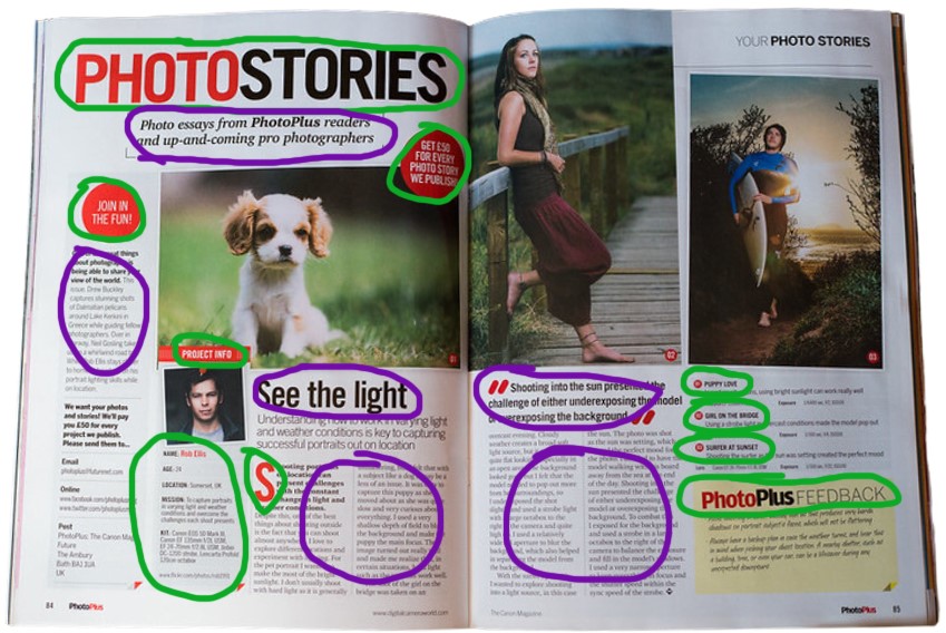
Notice above, the typefaces circled in green. This typeface is categorized as Sans serif. This is because this type of typeface does not have serifs at the end of the strokes. These are straighter, cleaner lines. There is no visible thick/thin transition in the strokes, and you can see the letterforms are the same thickness throughout the letters. The typefaces circled in purple are categorized as Slab serifs. Slab serifs have little or no transitions from thick to thin which make this typeface high on the readability scale. This typeface has a clean but straightforward look.
Typeface Contrast
There are various ways type can and should be used in a design. This designer uses type contrast very strategically. This designer used several contrasts in the below spread. This helps the reader focus on the material, and its purpose and can follow the information appropriately in the way the designer intended.
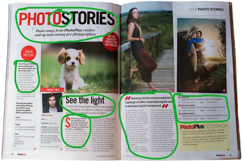
You will notice in the green circles, there are 3 different contrasts. You already know one contrast as the two different type categories, Slab serif, and Sans serif. Another contrast is color. The title PhotoStories, although the same typeface is set in two different colors. Red and Black as you can see where I circled the O and S. This contrast helps attract the viewer and understand visually this is a compound word with emphasis on what the topic is. The heading and subheading circled around that, show contrast with the two different typefaces as well as size. Another contrast is the weight and size of each of the typefaces. Notice how “See the light” as the title of the article is in a bold Slab serif, but the subheading is in a lightweight Sans serif typeface. Contrast helps the context become clear as to what the viewer should see first and helps to follow their eyes down to the rest of the body copy. Another example is to the right where the quote is in a large bold typeface, while the body copy is a regular and smaller weight. Overall, there is a contrast in typeface, color, as well as size, and weight used in this magazine spread.
Photography
This designer utilized Depth of Field in their photography for this spread. Photography is two-dimensional, so in order to convey a sense of depth a photographer or designer can include objects in the foreground, middle ground, and background. Another technique is overlapping, where you deliberately partially obscure one object with another. The human eye naturally recognizes these layers and mentally separates them out, creating an image with more depth.
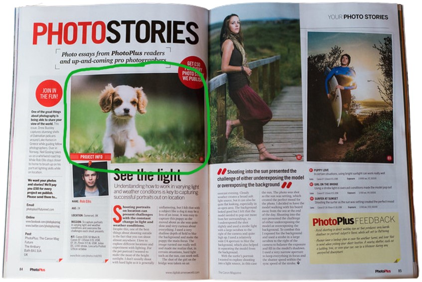
You’ll notice in the first large photo at the beginning of this spread, the photographer used Depth of Field with the dog as the focus, but the background is blurred giving the photograph a sense of depth. In this same photo, the grass in front of the dog is blurred as well. This means the photographer made the animal the middle ground focus making all other objects in front or behind it blurred giving the photo more depth. This adds more visual interest to the photograph.
Alternate Images for Layout
To show the effects of Depth of Field, I mimicked the main photograph in the spread to show how other images could still work in this magazine spread using the same principle. Each photo below is of a different subject but uses the same principle as the above magazine spread to prove how this principle can be used. Any of these pictures could replace the photo circled above to show the Depth of Field. In each below photo, the foreground and background are blurred with the middle ground focused as in the picture above. The blurred background darkens which also helps the subject pop out more. You can almost feel like you can grab the subject right out of the photo with this depth. It helps the subject in the image seem more tangible and real.


Conclusion
Overall, this designed magazine spread uses great design qualities by ensuring the basic principles of typography and photography design were used effectively.
- Category Identification is important to distinguish between typefaces so we can understand their qualities. By understanding their qualities, we can choose the best typefaces to enhance the design of the project and add visual interest to the spread.
- Typeface Contrast adds visual hierarchy to the design which helps the reader focus on the material, and its purpose and can follow the information appropriately in the way the designer intended.
- Photography in this spread utilized Depth of Field which put the focus on the main subject and blurred out the foreground and background to give the photograph depth. This put focus where the photographer wanted the viewer to focus, but gave the viewer a sense of realization adding depth to the photograph.
All of these principles combined made the magazine spread a more successful design. It all helped the information come together in a way that was appealing and helped convey the message clearly which not only draws in the audience but keeps them engaged in your design and material in a way the designer intended.

